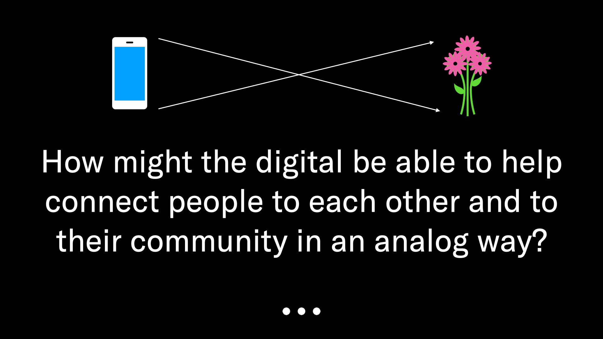
Is it possible to design a social platform that minimizes screen-time while maximizing face-to-face interaction?
What if we could ‘date’ the places around us?
Many working professionals tend to go to work in the morning and head straight home when the day is done. With the growth of social media and the lingering effects of the pandemic, these conditions have only gotten more pronounced, contributing to what some have begun to call “the epidemic of loneliness.”
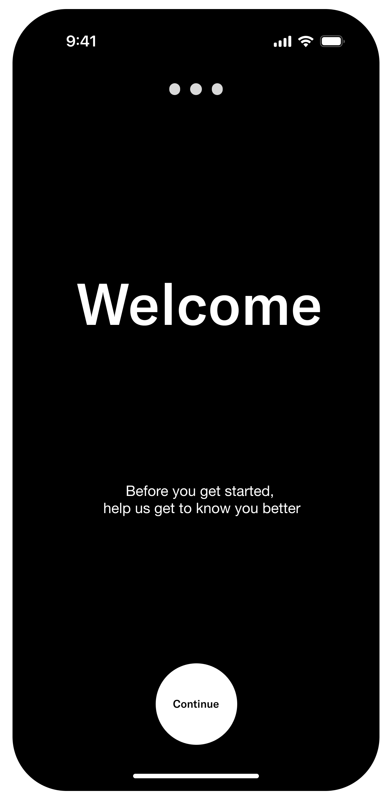
This project is an exploration in designing an anti-social social platform— where online interaction is minimized in order to maximize off-screen connection. The outcome is a streamlined application designed to cut through decision fatigue and help people explore the spaces and people in the communities that surround them.
Secondary Research
To better understand the landscape I was working within, I decided to dive into secondary research about American culture and our social fabric.
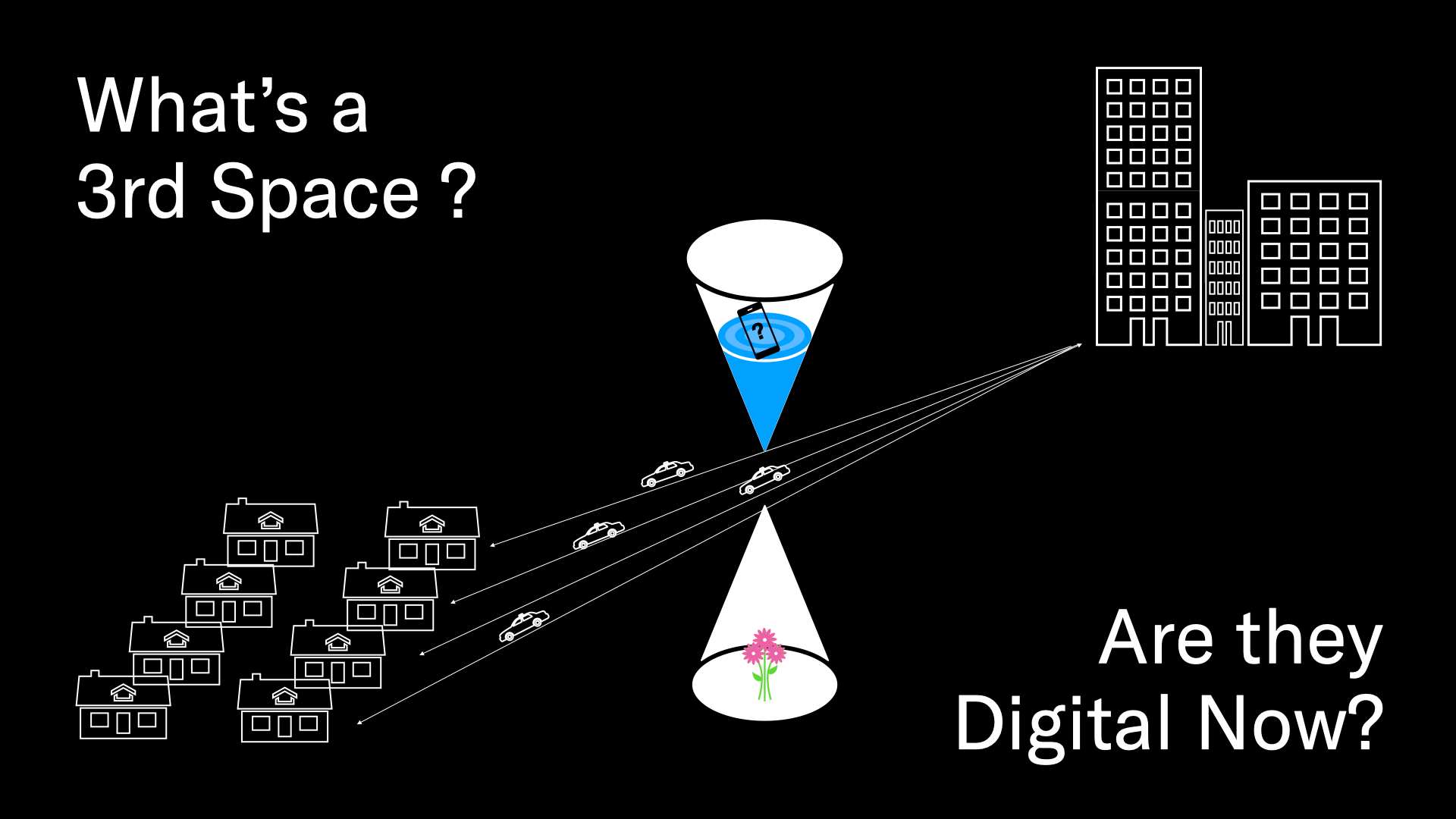
In sociologist Ray Oldenburg's book, The Great Good Place, he introduces the idea of the 'third place'— a welcoming, informal public space separate from home (the first place) and work (the second place). It's in these third places where people gather, socialize, and build community. These spaces—such as cafés, bookstores, bars, or community centers—serve as neutral ground for diverse social interactions, fostering civic engagement and a sense of belonging and community in society.
In his book, Oldenburg argues that suburbanization— the separation of work from home, and the commute that that requires— has lead to the disappearance of third places from the American urban fabric.
In this project, my goal was to see whether it's possible for a digital interface to interrupt our commutes and encourage users to participate in the events and casual conversations happening in the physical places around them.
Goal Setting
Studying Precedents
Before diving into designing, I studied precedents for this kind of application. I looked at Meetups, Facebook Events, Eventbrite, and Nextdoor.
These platforms, all designed for different functions, had somewhat similar goals to mine; connecting people in physical space to help people build community. However, the interactions and design of these platforms seemed to be much more effective for passive perusal and in-advance planning.
On them, you could easily find something to do for later this week, next week, or next month, But what about right now?
Preliminary Prototypes
The initial Prototypes were mashups of interfaces like social media and yelp, where Users could explore weekly recurring events like book readings, happy hours, and in-store knitting clubs as well as see whether anyone in their social circle was planning on attending.
In early prototypes and tests, users wanted more and more social features, slowly transforming the interface into a complicated and multi-tabbed structure.
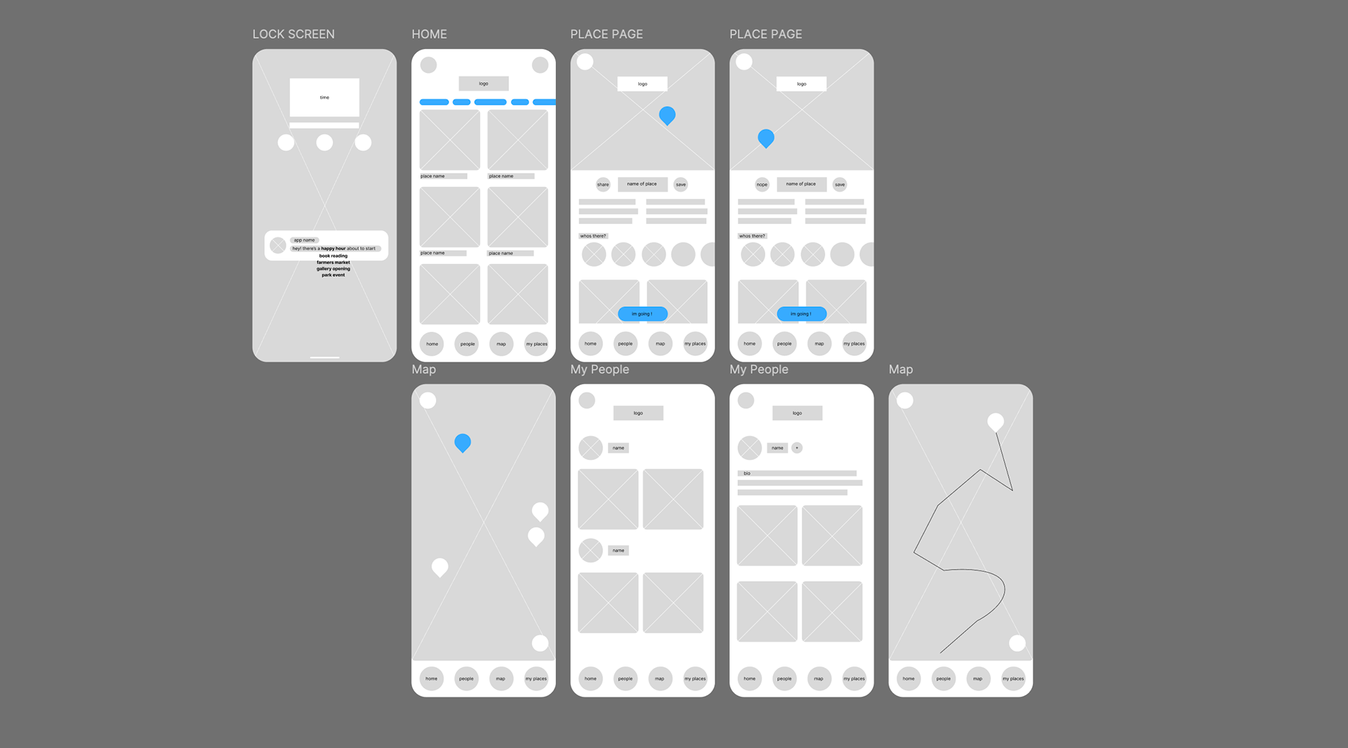
After each wireframe prototype, I preformed usability tests and interviews to talk to people about their experience navigating the app, and how it might be made better.
Like clockwork, every user wanted more social features: the ability to see who else is going, to follow people, and to message and share events within the app.
Primary Research
In order to actually test the app, I realized I had to get a little creative.
Because the app relied on the assumption of a high quality recommender algorithm, not only to show you what events were happening soon, but to show you events that you'd be interested in, I developed a methodology for testing in which I became a stand in for the algorithm.
I selected five participants that I know well, who live in places that I also know well, so that I could operate with the same knowledg base that the algorithm would have, to give them custom tailored recommendations that they could go to right now.
Research Process
1.
Each user pre-defined a time on Thursday evening when they would likely get off work, and told me about their usual commute home.
3.
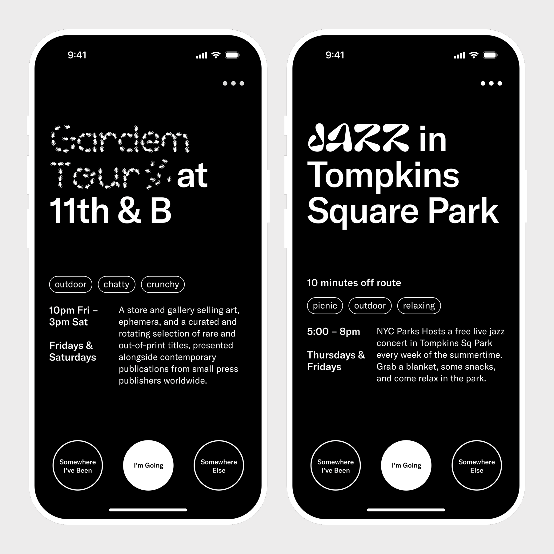
I gave them a set of three options: "I'm Going," "Show Me Somewhere Else,", and "Show me somewhere I've already been."
2.
I compiled a list of 10 places that I knew they would like, some they might have been to, and other places I was certain that they had not.
4.
At the time that they defined, I Greeted them, and sent them an option. Each one went through the process of selecting, and went to one of the places.
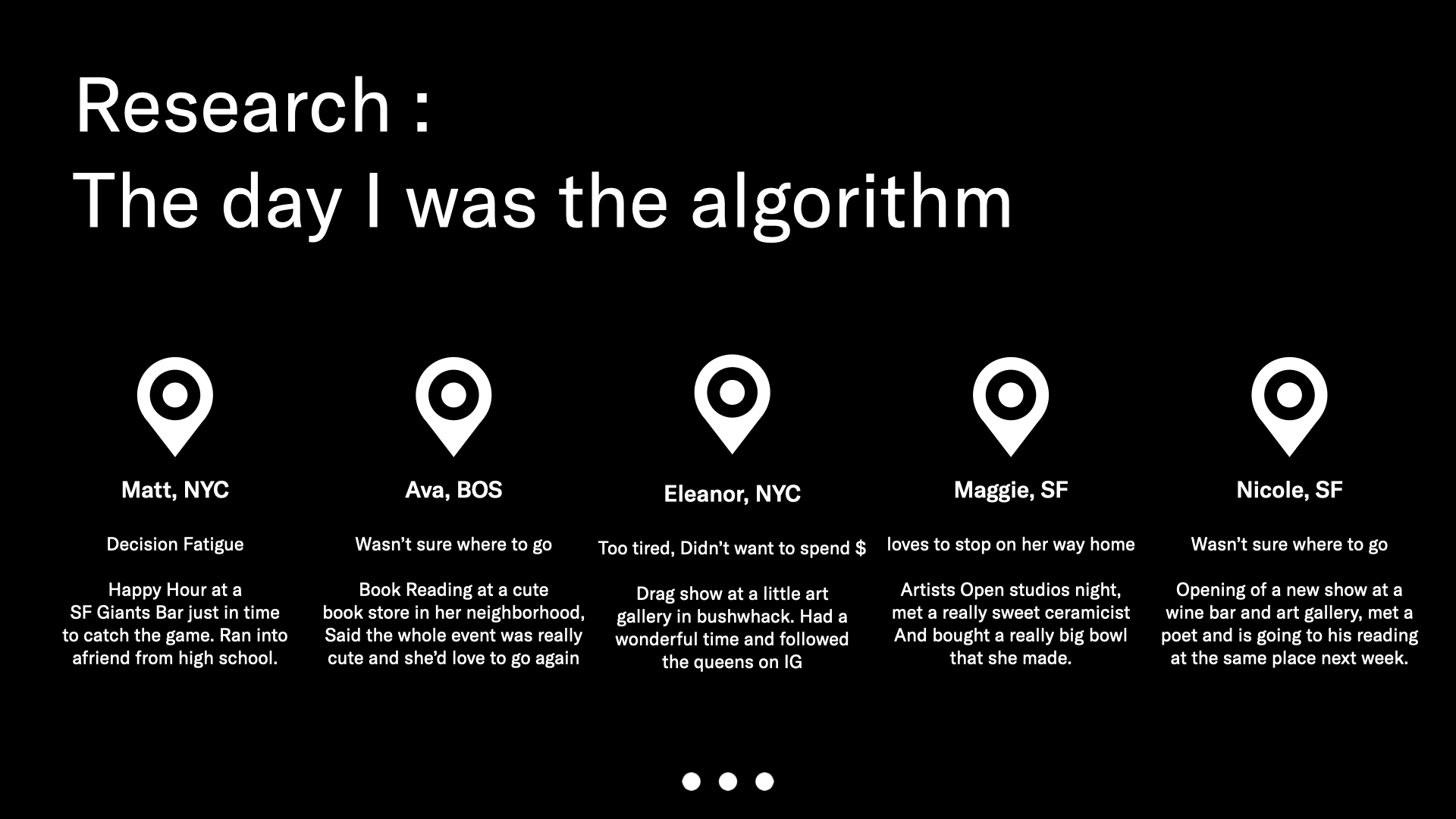
Afterward, I asked them to join me on zoom to look through the prototype and be interviewed.
All five of the participants were a little confused by the prototypes. They loved the experience they had just been through, and said that it did not need any of these complicated elements— the social part had happened once they got there, and all of the other features would just make that process more complicated.
a mock-up of an advertisement for the app, using the video documentation I asked the research participants to provide.
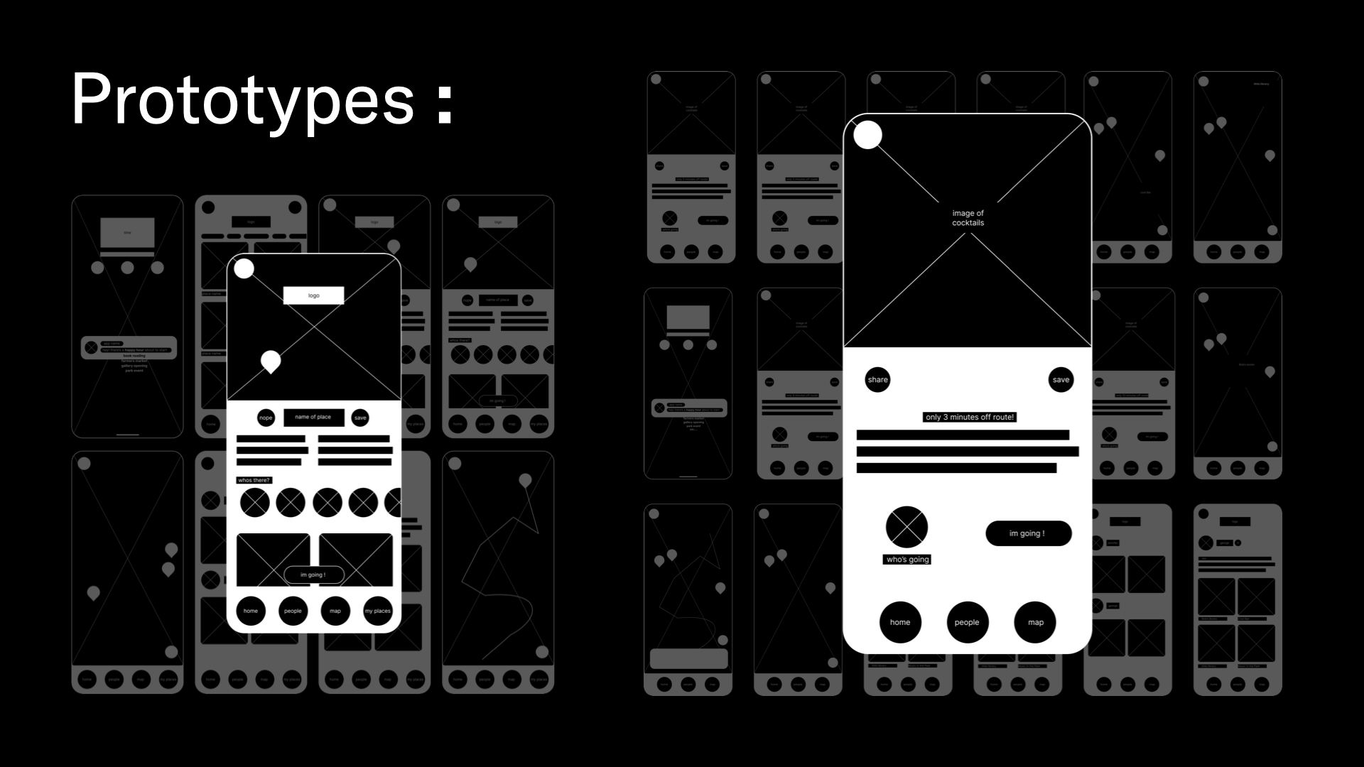
Reframing & Finalizing
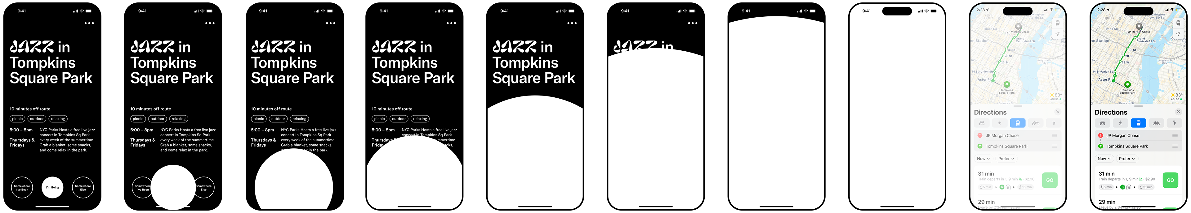
After the final round of research, and the clearest user feedback yet, I pivoted the app to prioritize only 3 choices (below). This happened to give the app a rapid, tinder-swiping feel, which users said was perfect for quick decision making.
The final application was designed with no images, instead using typography and description tags to communicate quickly to users.
The user flow became incredibly simple:
push notification ——> activity options ——> I'm Going ——> Map