The American Time Use Survey (ATUS) is a nationally representative longitudinal study conducted by the United States Bureau of Labor Statistics. It measures the amount of time Americans spend doing various activities, such as work, childcare, volunteering, and socializing. The data is collected in 'diary days,' where respondents report their activity from the prior day. The categories the dataset breaks these activities into are extremely comprehensive.
The ATUS, a favorite of many data journalists, has been used to publish stories on a multitude of topics, but one set of categories is consistently cast aside:
"Waiting associated with _________"
Tacked onto the end of almost every activity grouping, there are over 51 categories dedicated to different kinds of waiting. This data seemed to be the least explored and least visualized, so it was the one I decided to dig into.
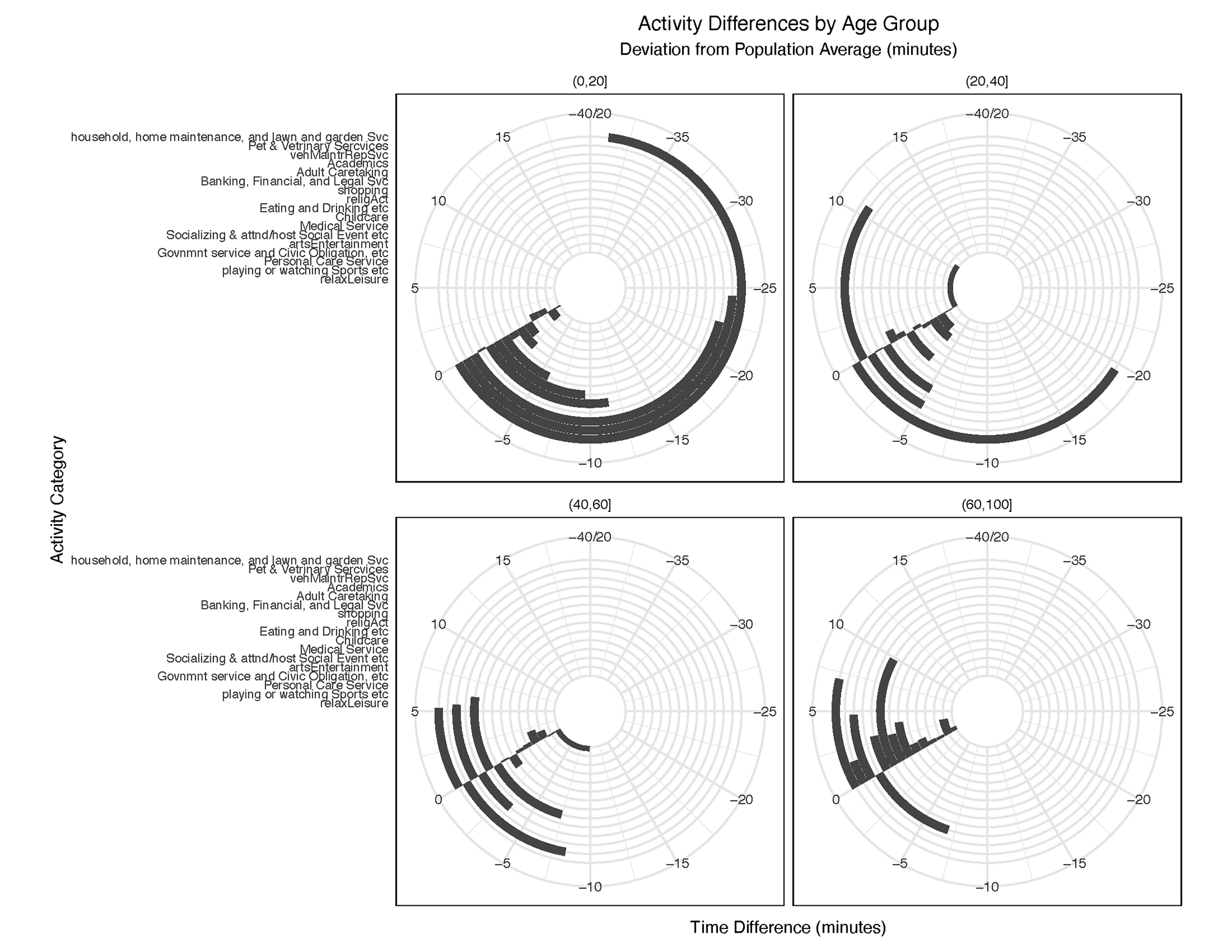
I sorted, filtered, and joined these expansive datasets in order to plot a variety of charts, the most interesting of which were edited in Illustrator for legibility and compiled into a final narrative: waiting (and the data that records it) may be just as boring as it feels.
Below you can explore my final data narrative, and some of my process in arriving there.
All of these charts were created using R, and later visually designed using Adobe Illustrator.


